
Land-take by ground-mounted solar installations
Key Conclusions
The total (nameplate) capacity of all viable, ground-mounted solar installations of <= 50MW (i.e. ‘sub-NSIP’ size) in the April 2026 Renewable Energy Planning Database (REPD) is 42,611MW (42.6GW), of which 10,025MW (10.03GW) are currently operational.
The total capacity of all Nationally Significant Infrastructure Project (NSIP)-scale installations of >50MW is 24,738MW (24.7GW), very few of which are currently operational.
The total capacity of all viable sub-NSIP and NSIP-scale ground-mounted solar installations analysed here is therefore 67,348MW (i.e. 67.3GW). Together with an estimated 5GW of rooftop solar, the grand total rises to over 70GW, approaching the current 2035 target of up to 75GW set by the Clean Power 2030 Report (CP2030).
For County/Unitary Authorities, Lincolnshire has the greatest total solar PV capacity (7,061MW), followed by Norfolk (3,783 MW) and Nottinghamshire (3,376MW). Lincolnshire therefore also has the largest share, 10.5%, of the UK’s total figure.
The frequently quoted figure of ground-mounted solar PV occupying only 0.1% of the UK’s land area is wrong. Currently the correct, UK-wide figure is nearer 0.51%, assuming all viable sub-NSIP proposals in the Renewable Energy Planning Database (REPD) and all Nationally Significant Infrastructure Project (NSIP)-scale solar proposals are carried to completion. The overall figure for England rises to 0.86%, well over eight times the quoted figure.
For smaller geographical areas, this figure can be much larger. At the County/Unitary Authority level the highest coverage is 4.6%, in Thurrock (164km2). For administrative units larger than 200sq. kms, the maximum coverage is 4.4% for Doncaster; for those above 1,000sq. kms, the maximum is 3.9% for Nottinghamshire.
A similar analysis was carried out for the 650 Parliamentary constituencies. Constituency areas tend to be smaller than administrative areas; hence the percentage occupied by ground-mounted solar is more variable. Folkestone and Hythe has the highest coverage (8.7%), followed by Newark (8.6%) and Rother Valley (6.8%). Thus, the smaller the geographical area considered, the larger the variation and the higher the maximum percentage land cover/land-take by solar installations.
All of the developments described here have been carried out without any rational, spatial plan. They have been opportunistically sited, apparently wherever a developer meets a willing landowner, and more or less regardless of other solar installations in the local area, or of the National Transmission or Distribution Regions.
Representative maps of County/Unitary Authority and Parliamentary constituencies are given in the Report, with full details to each administrative/constituency level in a series of Tables.
Ground-mounted solar installations. The UK’s most affected constituencies, June 2026
The Renewable Energy Planning Database (REPD) does not include all of the large area, ground-mounted solar installations that have been or will be submitted under the NSIP regime. SolarQ has digitised the redline boundaries for the 81 NSIP proposals for which maps were available by June 2026 and added these to the April 2026 REPD information for ‘sub-NSIP’ installations (i.e. <50MW), so that we can now rank the Parliamentary constituencies in terms of the total percentage of the area of each that is, or will be, affected by ground-mounted solar installations.
For the present iteration, information in the REPD on the area occupied by sub-NSIP installations (now given in the REPD) was used in a regression to calculate the average land-take per MWp installed capacity of these sub-NSIP schemes (the regression, with a slope of 1.734 hectares/MWp, is shown in the full Report). Areas of the NSIP installations were calculated directly from their digitised, redline boundaries. Only areas for solar panels and any associated biodiversity sites within the redline boundaries were included in the NSIP calculations; areas for cable runs (which can be very variable and are usually not fixed until a very late stage of the development) were not included.
The maps below show the 20 most affected constituencies and the footnote for each, in red at the bottom, shows the rank, name and percentage of the total area that is, or will be, affected. Within each map, the icons for the different developmental stages of the REPD installations (see the map Legend) are scaled according to the MWp capacity of each (the largest icons usually represent installed capacities of 50MWp; actual capacities are shown in the small call-outs near each icon).
The pale background colours of the maps reflect those of the parties of the sitting MPs (Labour red, Conservative blue, Liberal Democrats yellow and Reform purple) whose names, constituency names, party, percentage cover by solar installations (in green) and percentage of all UK ground-mounted solar within that constituency (bracketed figures in red) are in the callouts within/near each constituency. The key constituency on each map is outlined in purple; other constituency boundaries are in grey.
Use the left/right arrows to see the maps.
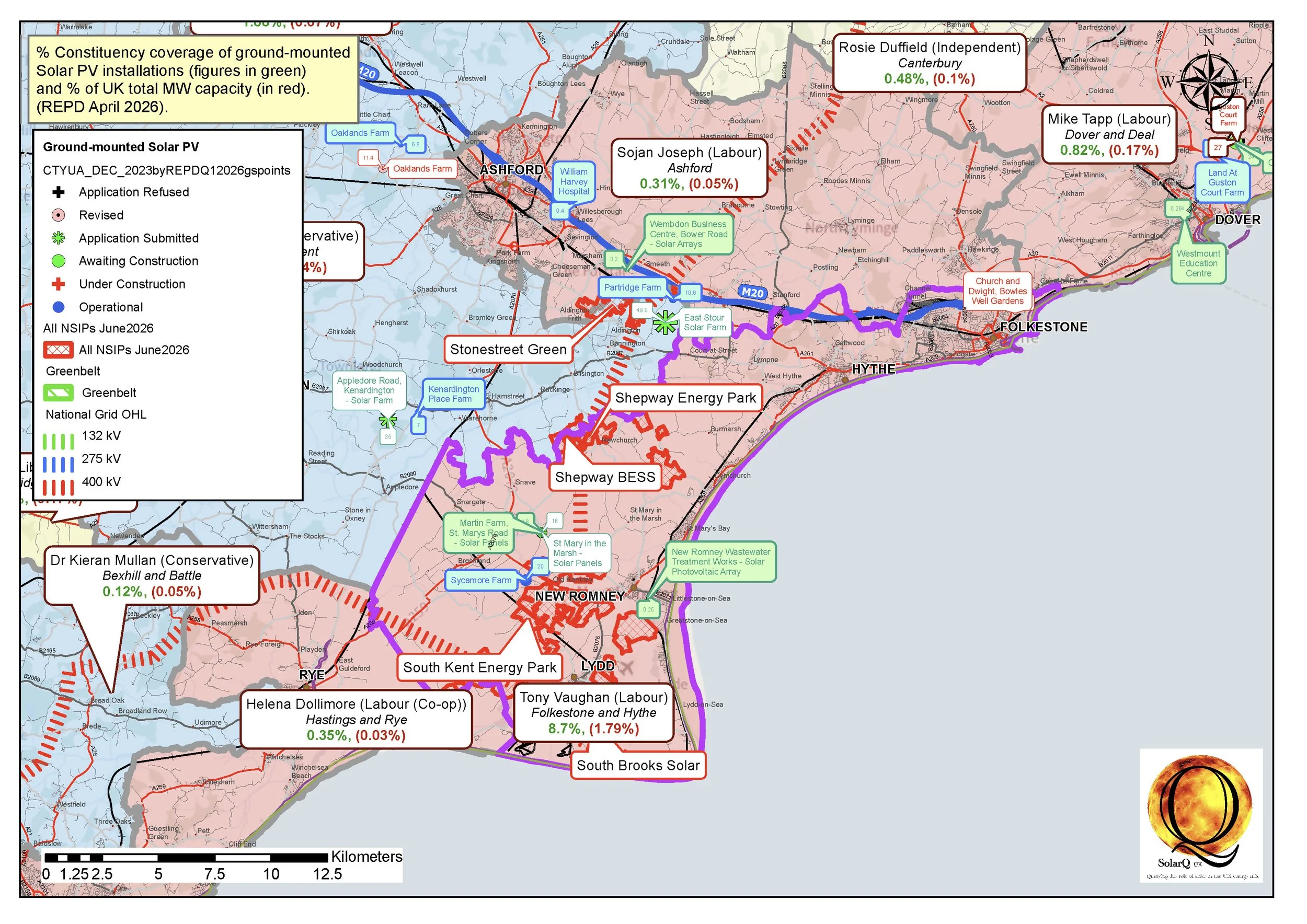
1 Folkestone and Hythe, 8.7%
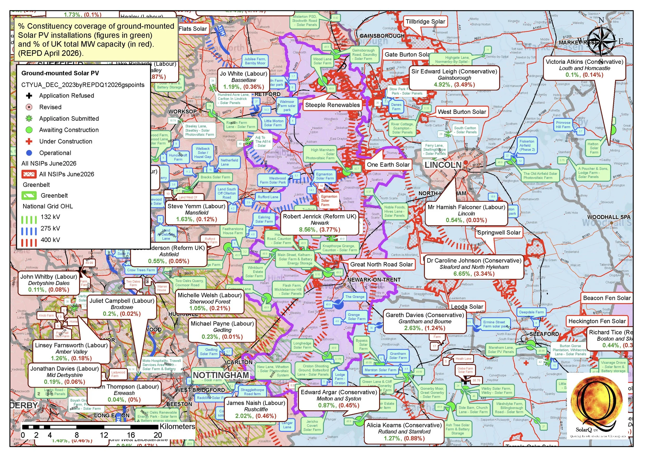
2 Newark, 8.56%
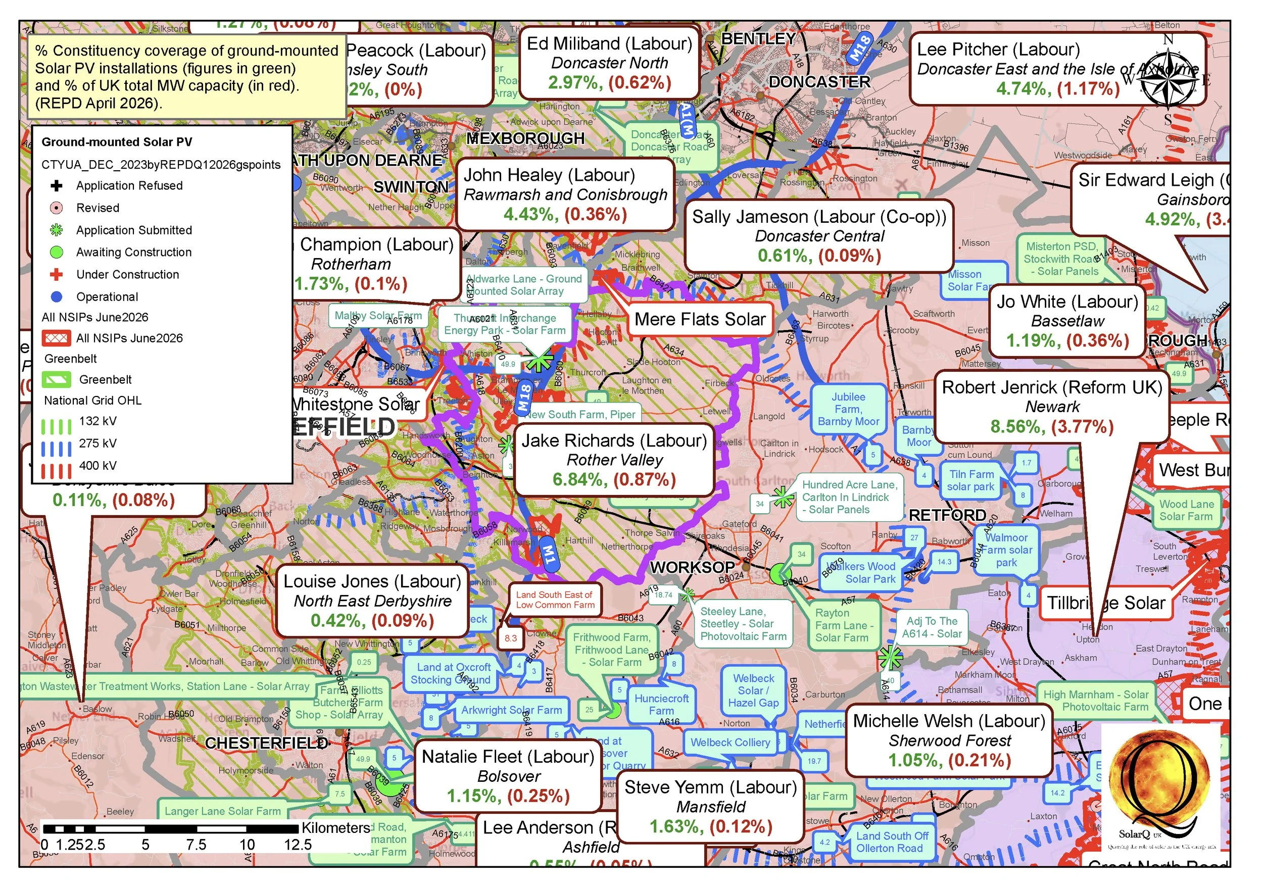
3 Rother Valley, 6.84%
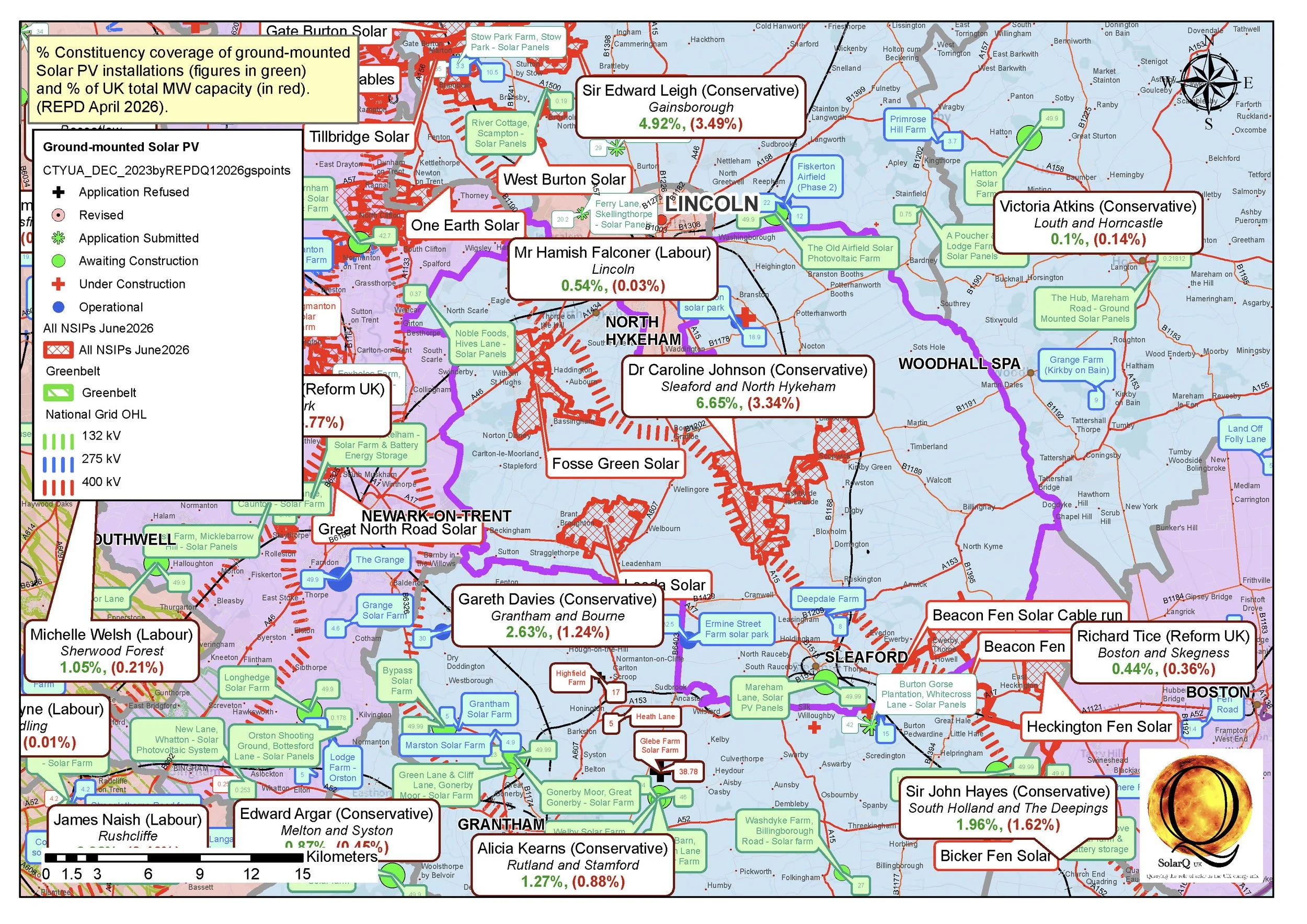
4 Sleaford and North Hykeham, 6.65%
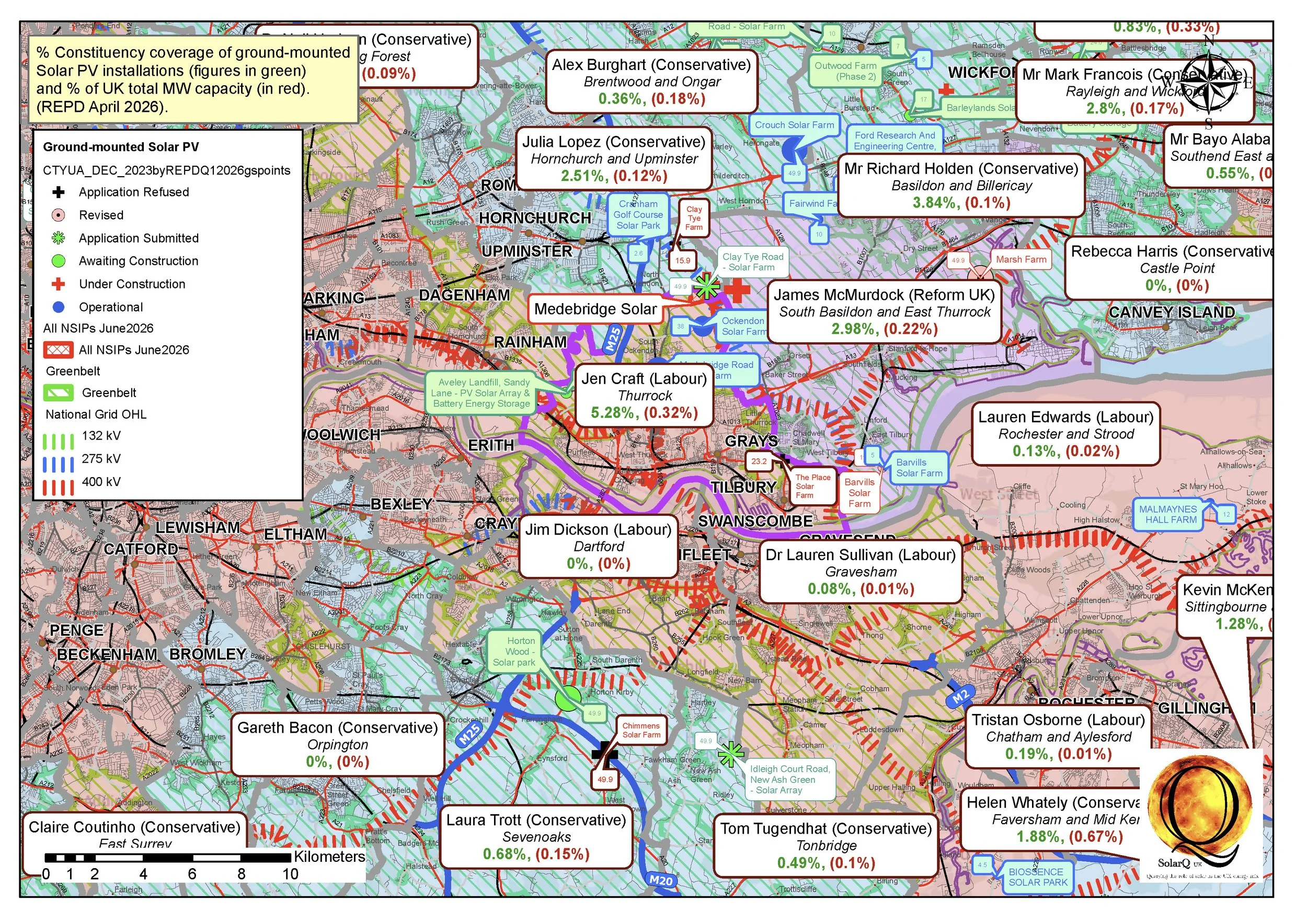
5 Thurrock, 5.28%
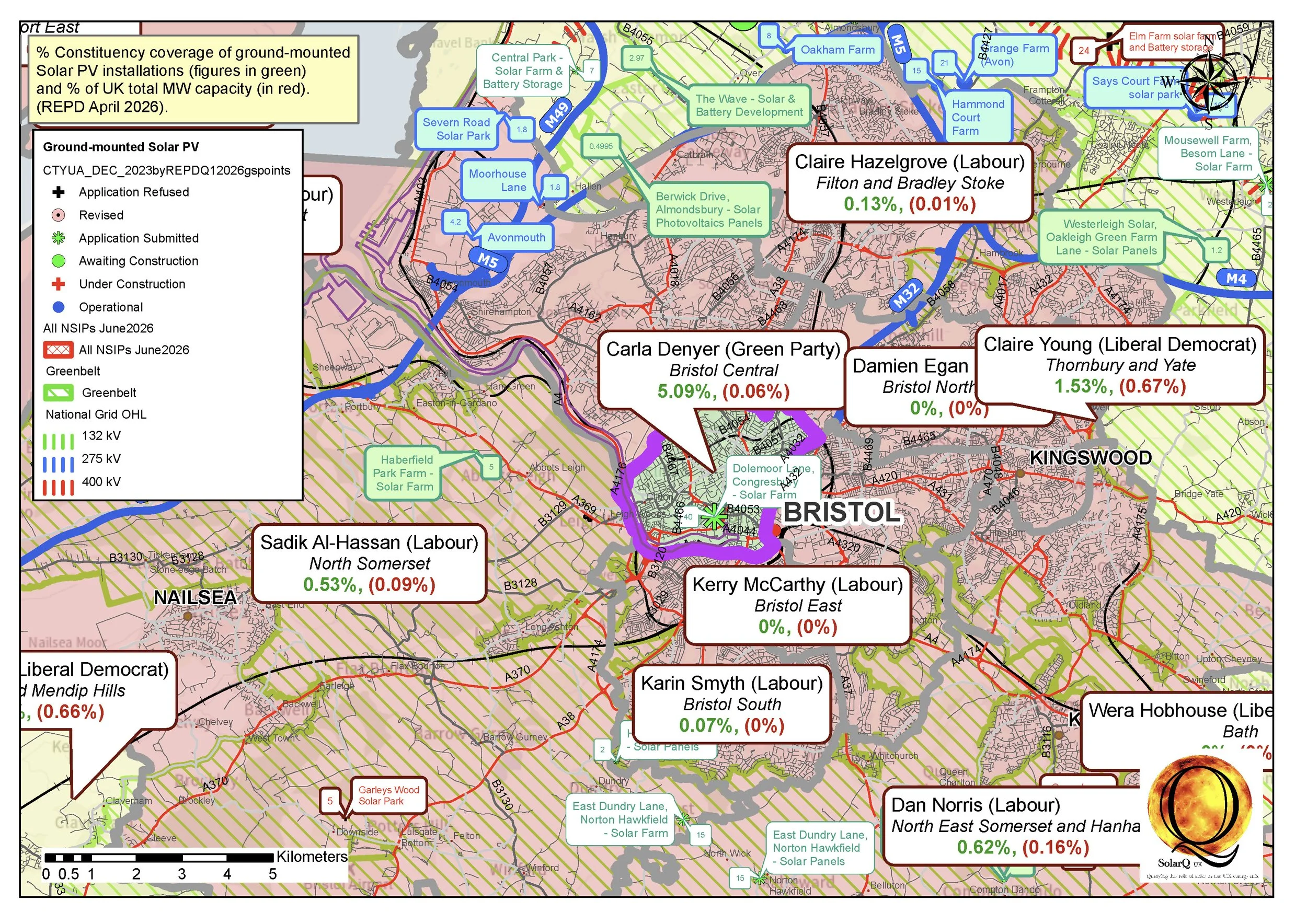
6 Bristol Central, 5.09%
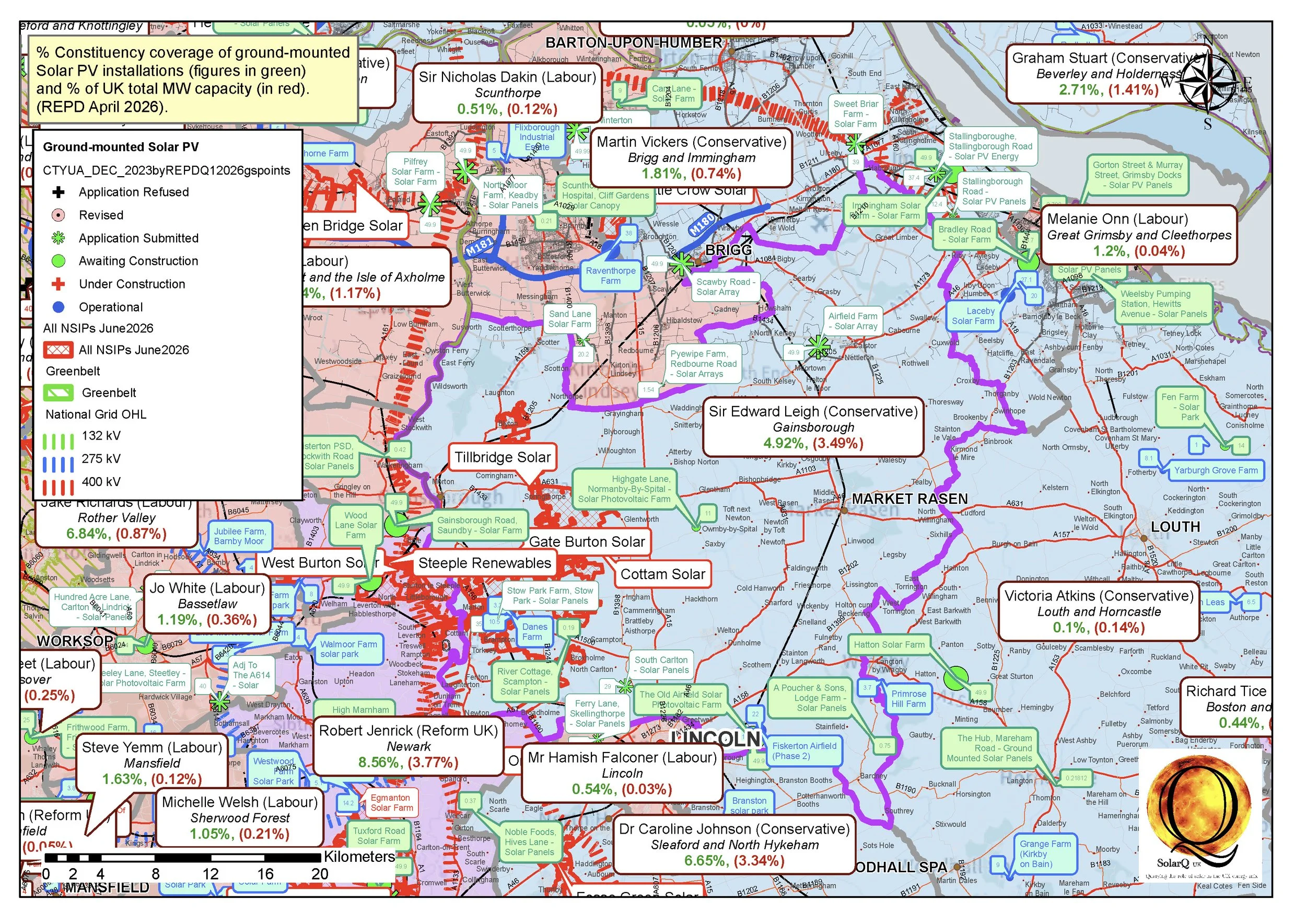
7 Gainsborough, 4.92%
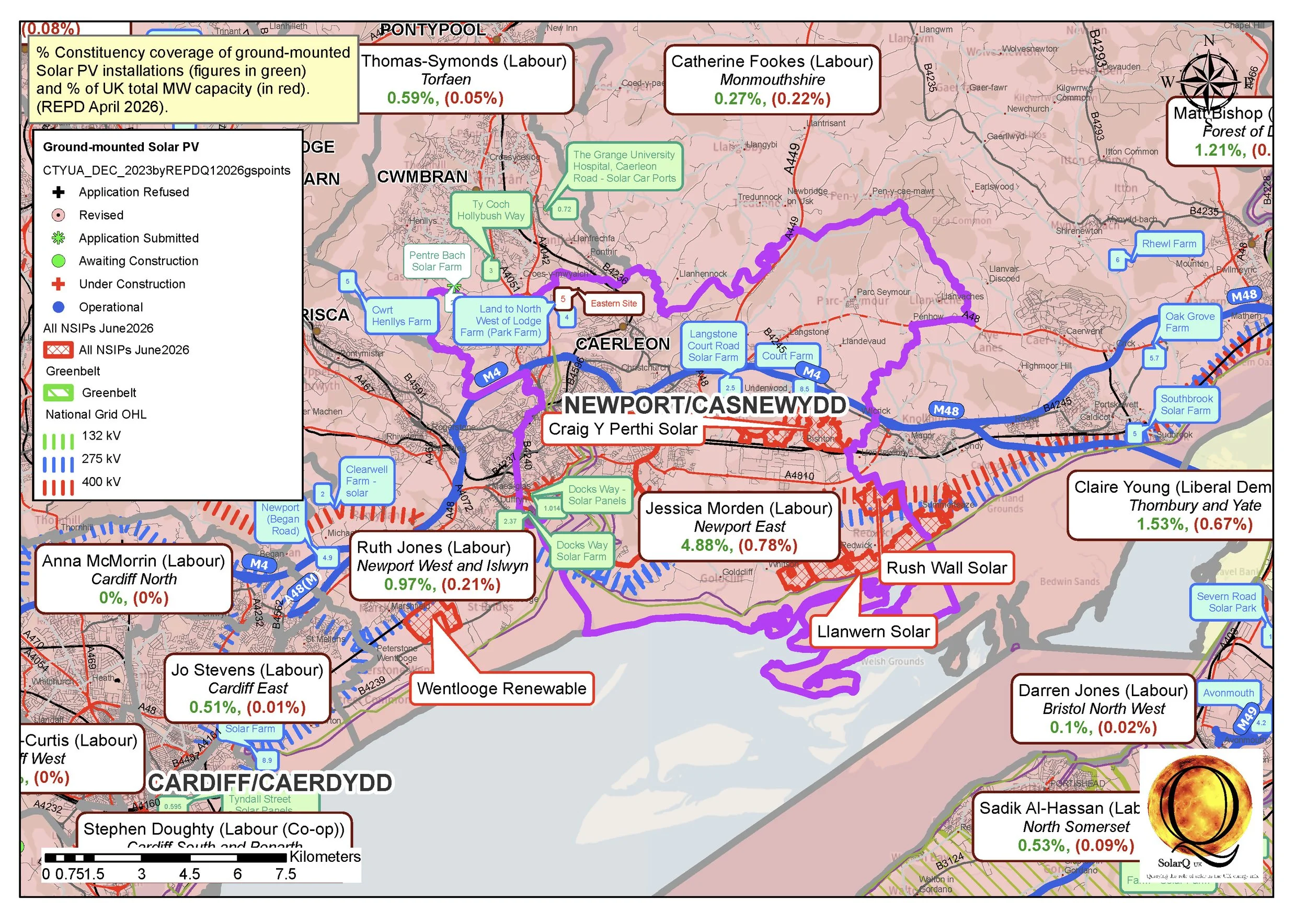
8 Newport East, 4.88%
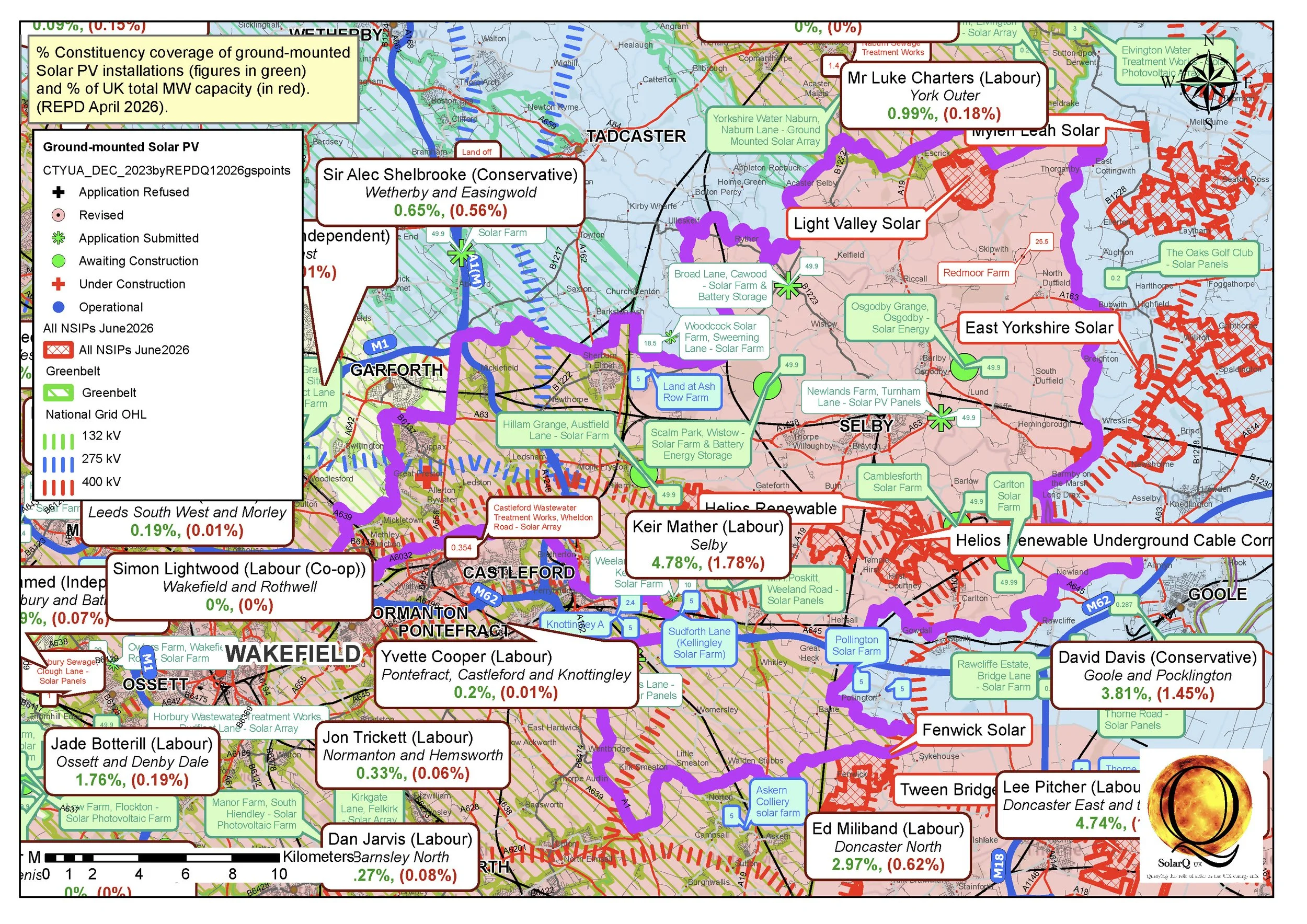
9 Selby, 4.78%
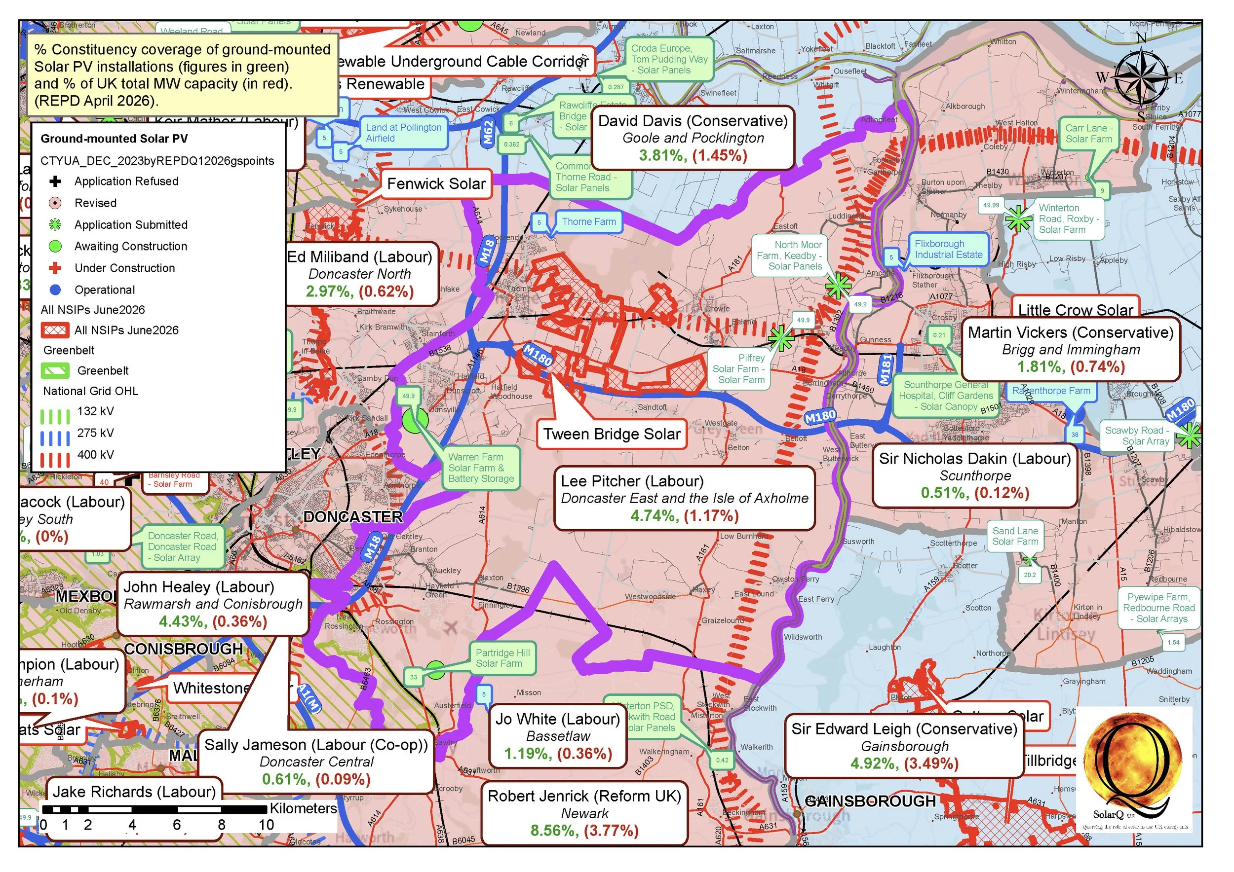
10 Doncaster East and the Isle of Axholme, 4.74%
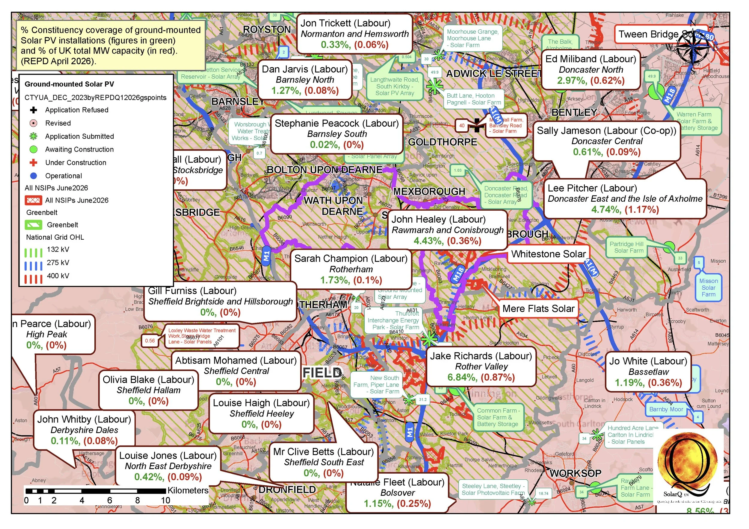
11 Rawmarsh and Conisbrough, 4.43%
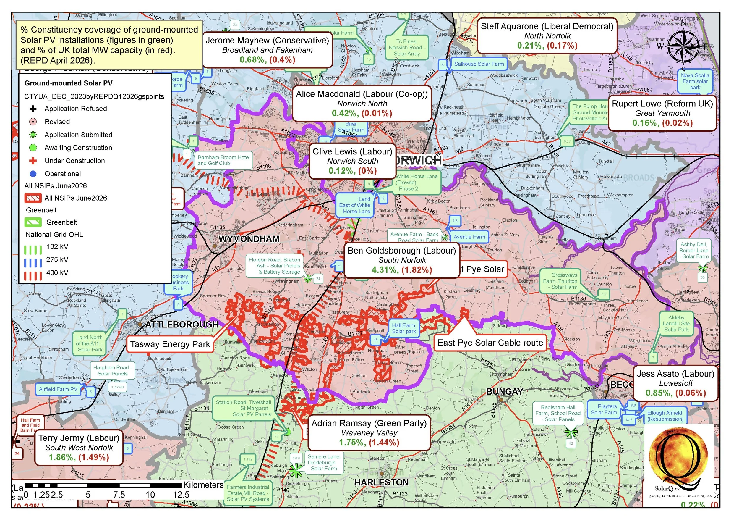
12 South Norfolk, 4.31%
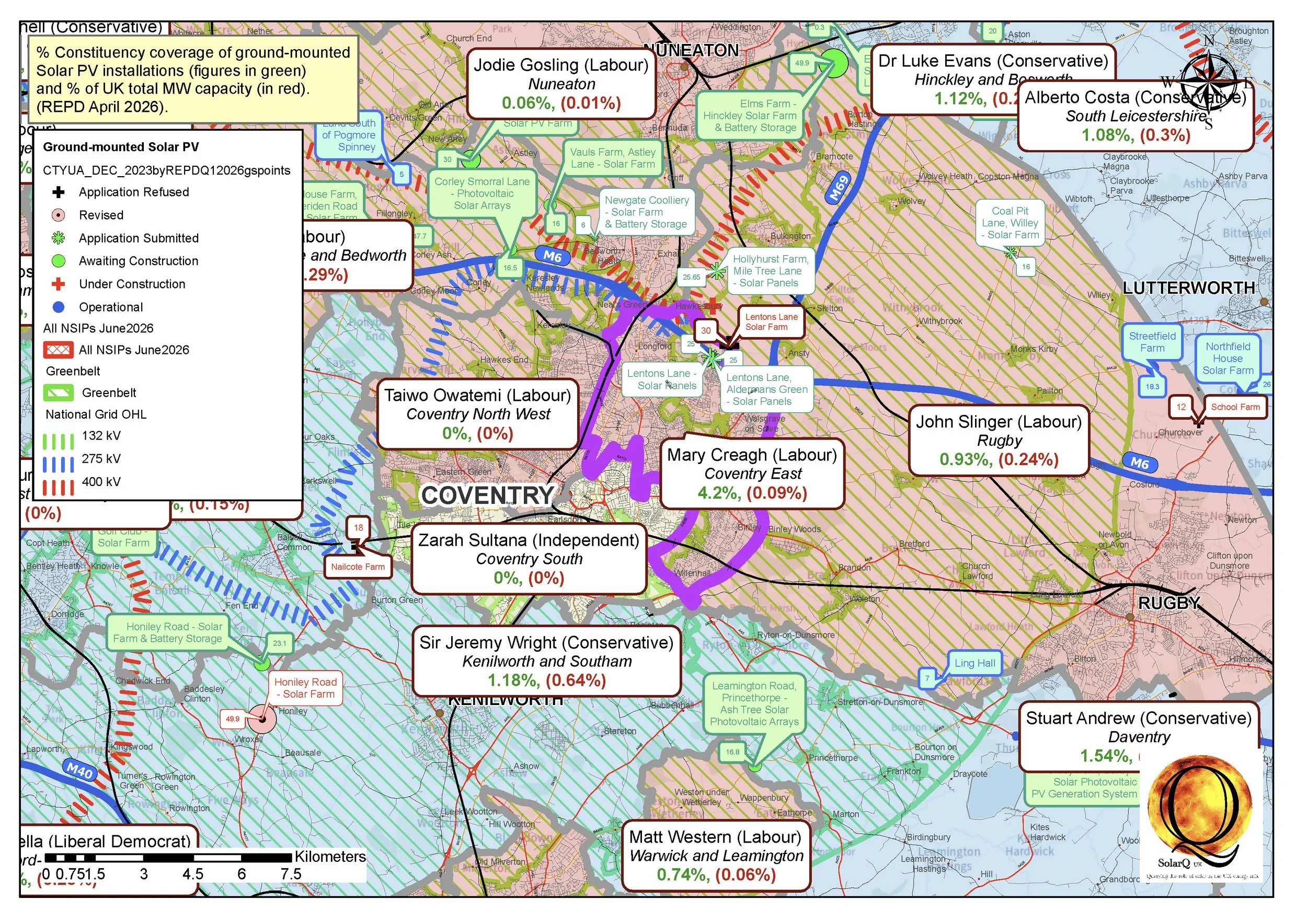
13 Coventry East, 4.20%
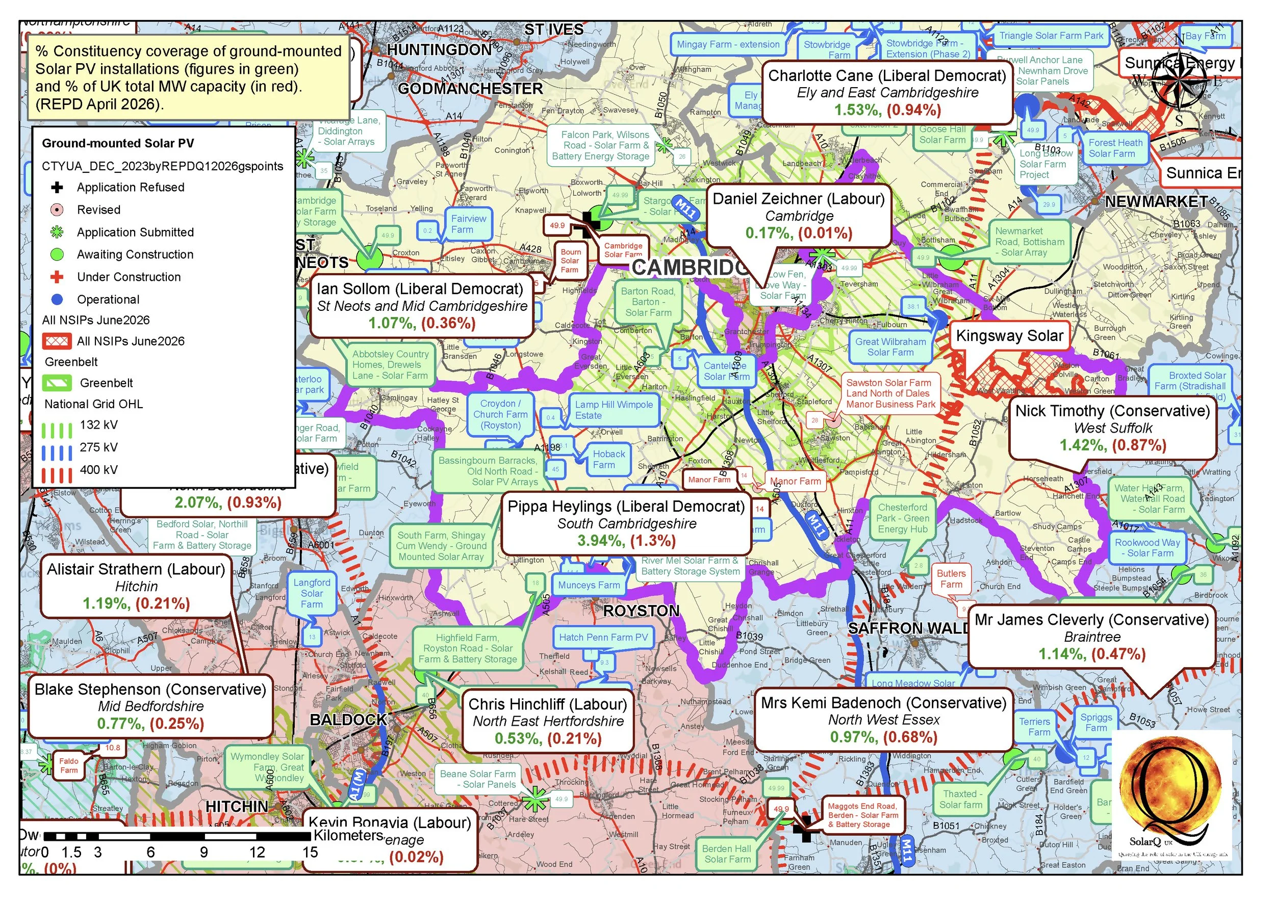
14 South Cambridgeshire, 3.94%
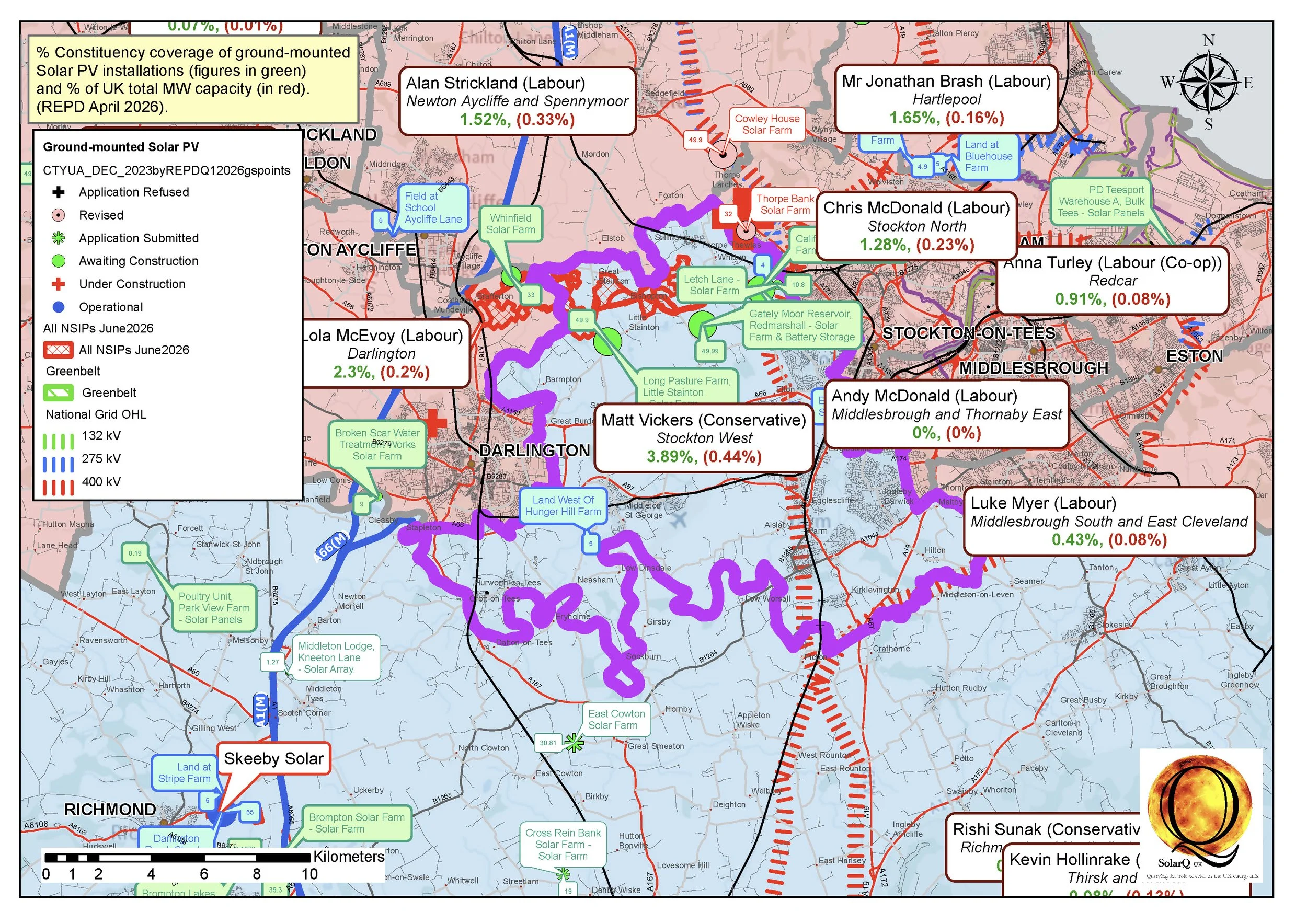
15 Stockton West, 3.89%
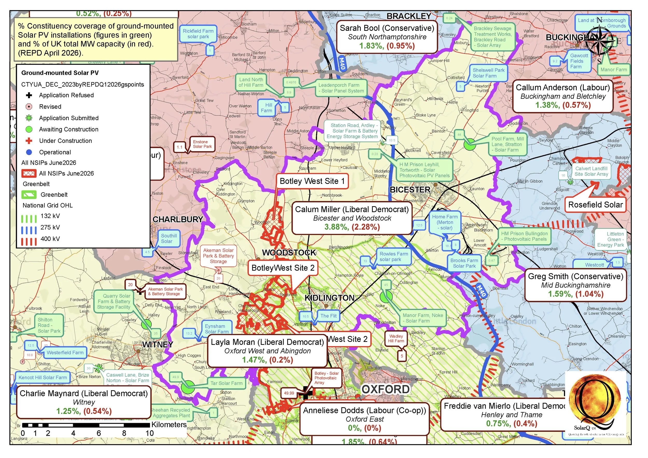
16 Bicester and Woodstock, 3.88%
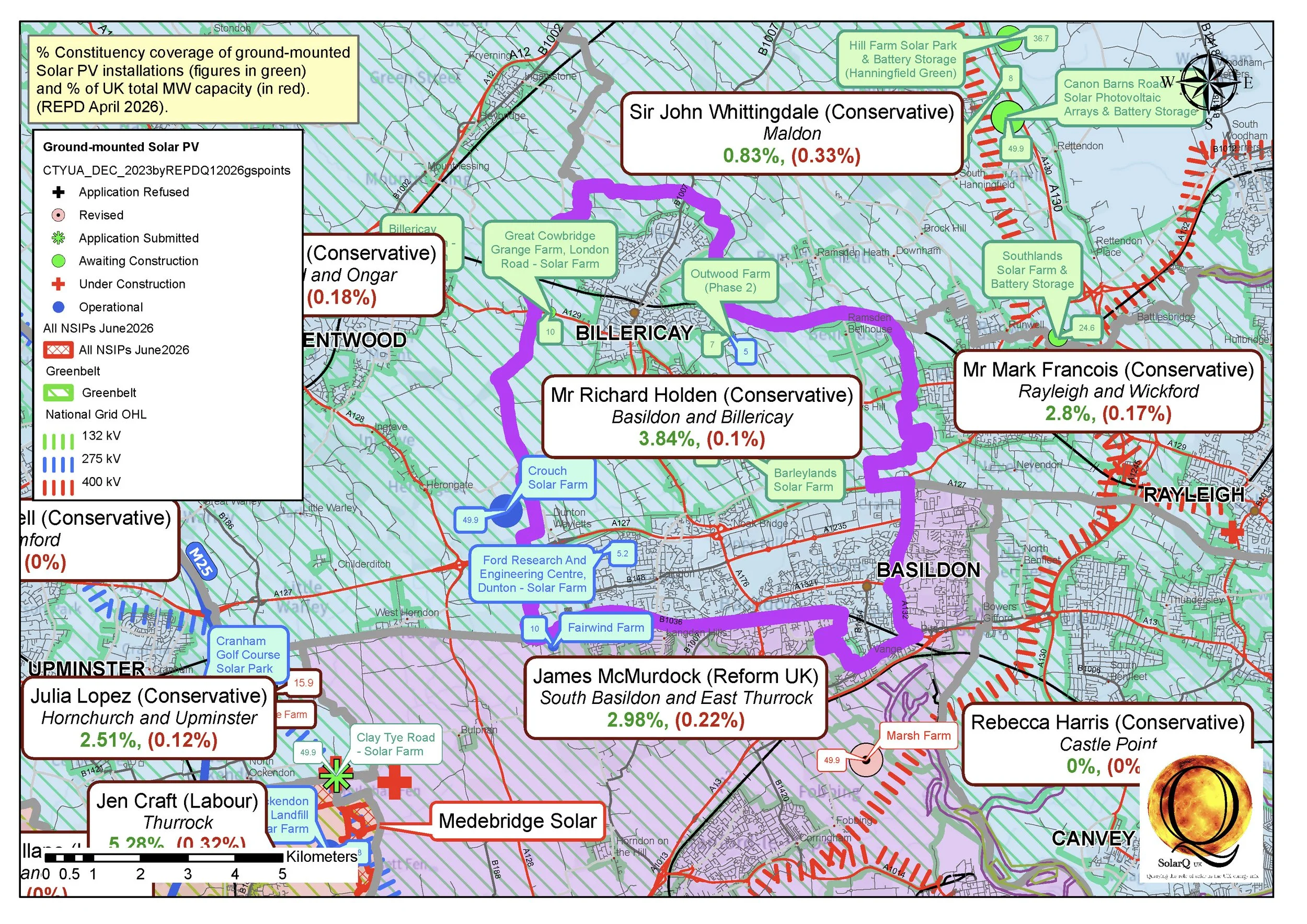
17 Basildon and Billericay, 3.84%
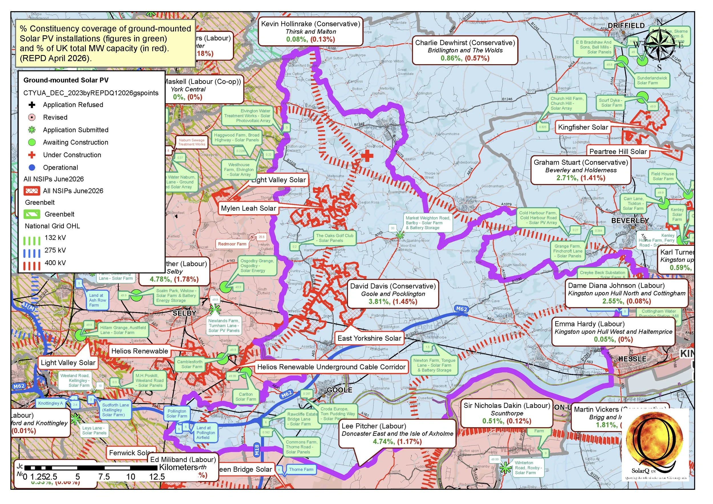
18 Goole and Pocklington, 3.81%
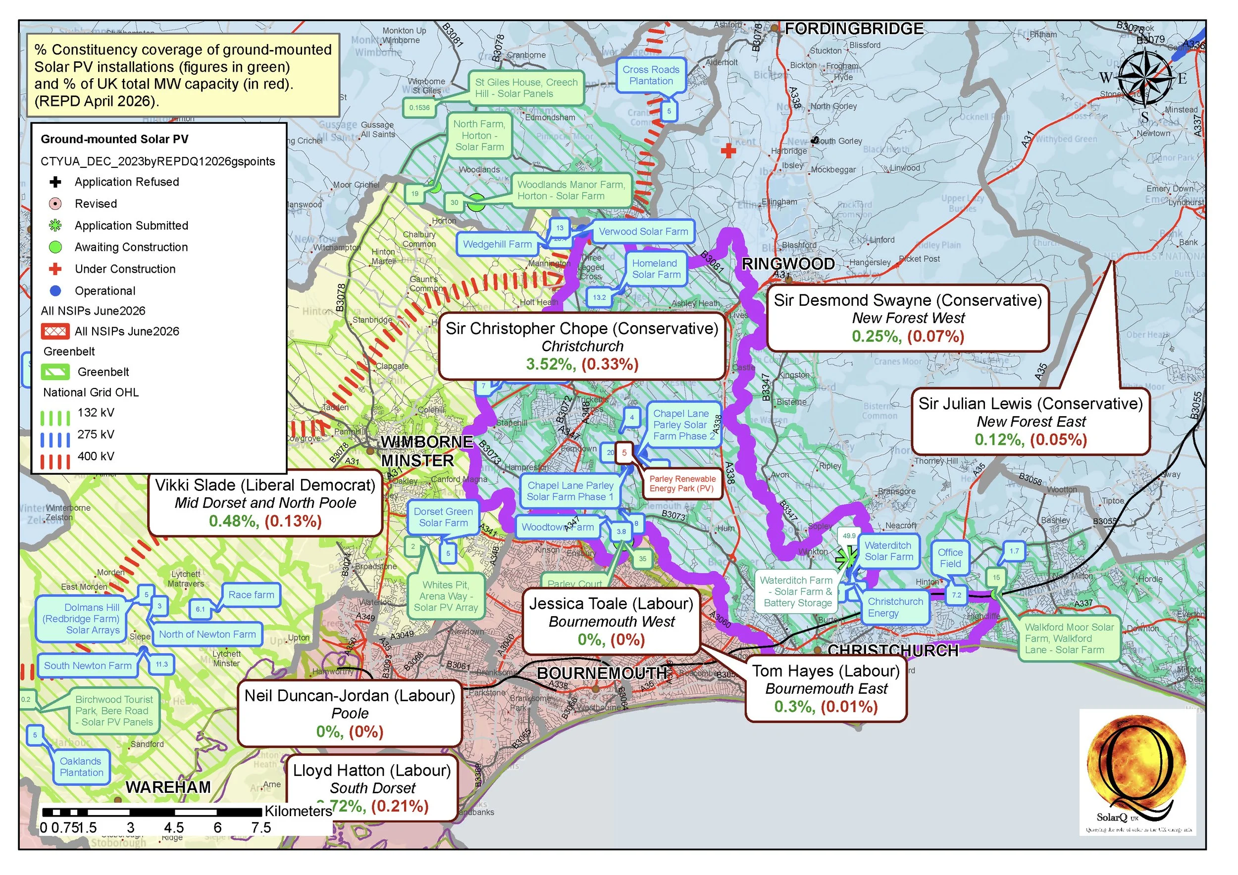
19 Christchurch, 3.52%
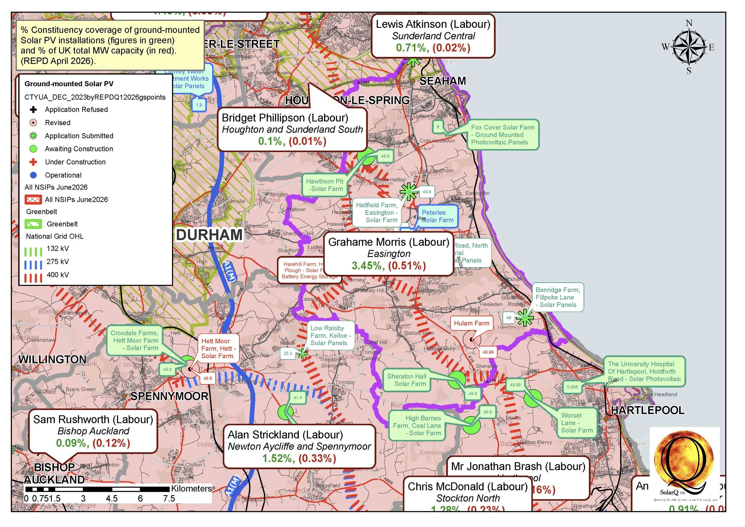
20 Easington, 3.45%